In email marketing, a call to action can be the difference between a new visitor on your landing page or a deleted email.
With the battle for attention now as email recipients are skimming their inboxes, an optimized email call to action button is your solution to not be ignored.
There are many different types of CTAs out there, including buttons, text links, and images.
Each one has its own strengths and weaknesses. The key is finding the right combination of these elements for each campaign you send out.
What call to action to include in each campaign? This article answers it.
Here is what you’ll learn after reading this article:
- What is a call to action in an email
- 79 call to action examples that get clicked
- 4 tips for using CTAs effectively in your emails
What is a Call to Action (CTA) in an Email?
A call to action in email is the button or link a sender includes with their email that prompts recipients to take a specific action.
What are some of the benefits of using CTA buttons on emails?
CTAs can drive increased email click rates, which results in more conversions and revenue.
CTAs have also been proven effective at persuading people into performing an action. The action you want your contacts to make by providing them with pertinent information about what they need to do.
You’ll have to use compelling descriptive copy on and around your email CTA button to help persuade recipients into clicking on it.
Further down the article, I’ll cover more tips in-depth, so keep reading to learn more.
79 Call to Action Examples That Get Clicked
Your CTA is a significant element that contributes to your email CTR, so email marketers should be careful about:
- What to write in the CTA button
- What to write before the CTA button
- How to design their CTAs
- Where to place them
In general, you want your CTA buttons to stand out from the rest of the email content, so they get noticed while scrolling an email.
To help you out, here is a list of CTA copies that you can use for your different emails.
24 CTAs to encourage clicks for content
- Read more
- Learn more
- Read the full story
- Discover more
- Curious? Read on
- Explore now
- Read it now
- Download the eBook
- Download now
- Keep reading
- Read the full story
- Watch interview
- Watch video
- Listen now
- Check interview
- Watch replay
- See the picture
- Open gallery
- Watch gallery
- View the trends
- See report
- Take me to the blog
- Check it out
- Get insights
9 CTAs to collect customer feedback
- Share your thoughts
- Take a survey
- Leave a review
- Complete survey
- Your opinion matters
- Let us know how we did
- Complete our 5-minute survey
- Give us your feedback
- Share thoughts
- Rate us now
- Rate!
6 CTAs to increase social media followers
- Follow us
- Join Facebook group
- Like our page
- Let’s keep in touch
- Join community
- Let’s connect
40 CTAs to encourage purchase
- Buy now. Pay later.
- Buy it today
- Buy now
- Buy online
- Shop now
- Shop collection
- Shop our fall collection
- Shop now. Get 50% off.
- Shop our best sellers
- Shop special offers
- Act now
- Save today
- Don’t wait. Save now.
- Yes! I want one.
- Order now
- Repeat your order
- Claim your coupon
- Reveal my mystery coupon
- Start saving today
- See the deals
- Seal the deal
- Get 50% off now
- Shop for the clothes you want
- Get the style you want
- Get your winter wardrobe
- Get free shipping
- Free gift with purchase
- Try the new flavor
- Grab this deal
- One day left
- Shop the looks
- Finish shopping
- Shop mens
- Shop womens
- Today only!
- Shop the sale
- Shop all
- Get the book
- Shop our picks
- Bundle up
4 Tips for Using CTAs Effectively in Your Email Marketing
Email provides a sense of urgency that other mediums can’t offer, as well as immediacy which allows email marketers to reach and convert their target audience quickly.
Use the following 4 tips to optimize your CTA and get more clicks.
1. Button size
Depending on your email design, your call to action should be large enough to stand out in your email. Which will make it visible for your recipients to click or tap on their mobile devices.
Personally, I’m a big ambassador of testing and experimenting with email marketing.
I recommend experimenting with different sizes to determine what works best for you.
A good rule of thumb is to use a font size of at least 16 px for CTA buttons, especially if your emails will be read on mobile, which they probably will be.
Does size matter when it comes to CTAs?
Bigger is not necessarily better. Your button should stand out, but it shouldn’t be aggressively large relative to the copy in the email.
2. Number of CTAs
Most email marketing providers like Automizy allow you to add more than one CTA button to your email.

However, the consensus seems to be that it’s better for recipients if there is only one call-to-action visible at a time.
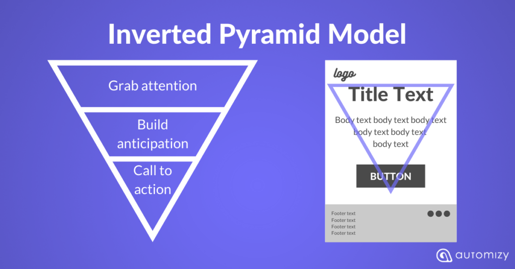
That’s actually what the Inverted Pyramid model of email marketing is based on.

Multiple CTAs are usually recommended for a lengthy email design.
If you have multiple CTAs on an email campaign, make sure to include them in different areas of the email body so they don’t seem like spammy repeats.

3. CTA placement
Where you place your CTA buttons is important for email design.
It’s important to make sure that your email is easy to read.
But don’t just put the CTA where it can be easily seen, think about how you want recipients to act on those calls too.
If your contacts are into reading your email and then they get pushed by a misplaced call to action button out of nowhere, chances are they’ll skip over.
Your CTA in the email can be a button or a linked text. So you should use the suitable format where it fits the most.
If you’re sending a rich-text email, adding a CTA button would look awkward. However, linked text looks better.
If your email campaign has a singular focus with one CTA, the placement should follow the logical behavior of email recipients. People typically read from the top left to right of an email, so it makes sense to place your CTA buttons towards the bottom or to the right of the content.
The most common CTA placement today is the bottom middle. Obviously, the purpose is to keep the CTA and the whole email mobile-friendly.
4. Call to action copy
This is, by far, the most important CTA tip.
You need to make your call-to-action copy clear and compelling for email recipients.
That means you need an offer that they’ll want in exchange for giving up their attention or money.
What does this mean? It means a good copy is essential when it comes to email marketing CTAs.
CTA buttons should be descriptive too so people know what exactly they’ll get if they click on the button, even before seeing anything else about the email campaign itself.
For example, “Get Your Copy Now!” as opposed to just “Click Here.”
Here are some tips for applying when writing your CTA copy:
- Use action verbs
- Grab email recipients’ attention
- Be specific about what the email recipient will get if they click on your CTA button.
- Create urgency
- Keep it brief
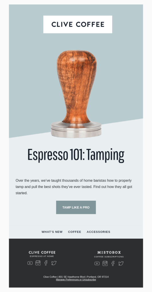
Here is an example of a creative CTA button with short unique text “TAMP LIKE A PRO”.

I recommend using the same language and words on the call to action copy that was used in the copy before that.
For instance, if the sentence before the CTA button says “Read guide to learn more about us”, your CTA button copy should be “Read Guide”
This reinforces the call to action.
Conclusion
Email marketing is a crucial channel that many marketers struggle to use effectively. The email call-to-action button can be the difference between driving sales and making no sales at all.
Use the tips and examples shared with you in this article to optimize your email click rates.
In the end, it all comes down to experimenting and tweaking your CTAs until you get it right. Take your time testing and improving your email marketing performance.

