
You work hard to create products and services and set up email campaigns to get your contacts to open it, click it, and convert to customers.
Naturally, you need to create an appealing email newsletter design to amaze your contacts and still convert them.
You need an email campaign that represents the balance of Beautiful & High-converting.
BINGO! You’re at the right place.
By reading this article, we’ll go over the best email design guidelines and tips to help you create a beautiful campaign that converts.
Here is what you’ll learn reading this article:
- 5 email newsletter design elements
- 5 email newsletter design guidelines and tips
- 11 engaging newsletter design ideas and examples
- How to design an email signature
5 Email Newsletter Design Elements
1. Sender name and email address
Sender name is the name you want to display in your contacts’ inbox or mobile notification when you send an email campaign.
I recommend you keep it identifiable and straightforward to make it easier for your contacts to recognize you.
Here is how your sender email would display in an inbox.

If you’d only put your name, your contacts might be like, “Leon who?!”

For the recipient, using just a name can feel like you’re tricking them into opening the email by making it seem like a general business or personal email.
So either go with a name plus company or just the company name as the sender name.
2. Subject line
If you’d ask about my personal opinion, email subject lines are more important than the email content.
Yes, you read it correctly.
Here are 5 reasons why email subject lines are the most important element of your email newsletter:
- Contacts won’t see your email content and CTA unless they’re satisfied with the subject line.
- A lousy subject line can make your email newsletter end up in spam and junk folders.
- A good subject line provides the right expectations for your contacts.
- A good subject line can get people to open your email and discover what you have to offer.
- There would be no CTA clicks unless your contacts opened your email in the first place.
These are the pretty basic reasons why you must pay extra attention to your email subject lines and how it’s designed to appear in an inbox.
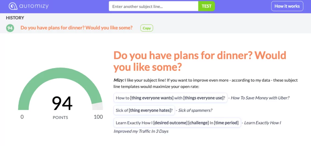
Here is an announcement email campaign subject line that I sent to our users at Automizy announcing the new landing page builder. The campaign scored a 24% open rate.

It’s a straightforward subject line that sets the right expectations, short enough to look good on a mobile notification, and I added an emoji to give a celebratory feeling to the announcement.
You can use our free Subject Line Tester to score your subject lines before hitting send.
Testing your email subject lines helps you:
- Avoid using spammy terms
- Test subject line effectiveness based on data from over a million campaigns
- Reduce guess-work
- Increase your email open rates
3. Preheader
Email preheader is the small text line that appears after your subject line in an email inbox or notification bar.
You can write the email preheader yourself, or by default, the first couple of words of your email will be displayed in the preheader section.
Use your email preheader to give a summary of your email content.
Sometimes, preheader text is referred to as “email preview text.”
Here is an example of how a preheader looks in Gmail.

If you’re an Automizy user, you know that you can set up your preheader while designing your newsletter.
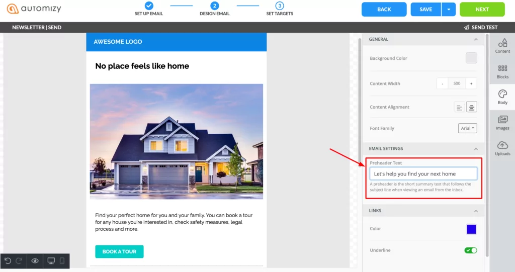
If you’re new here, sign up to Automizy and use pre-built email templates, add preheader text, and engage your audience with responsive emails.
Email preheaders might display differently on different inboxes or devices. Make sure to send test emails before sending your campaign to prevent formatting issues.
4. Email layout and content
The optimal email width for newsletters is between 500 and 650 pixels.
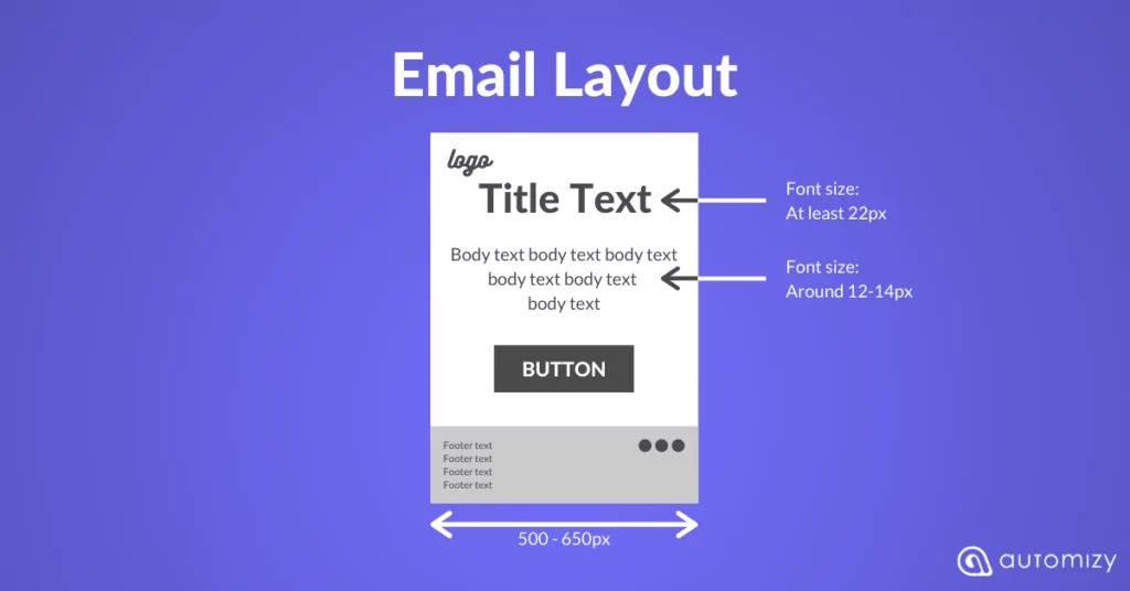
The email body copy’s ideal font size is around 12-14 pixels, and the title should be at least 22 pixels, which provides proper readability on mobile devices.
The layout of your email should be well-spaced, with distinguished sections. Use blocks, padding, spacers, and dividers to create a clean and visually pleasing email layout.
For your email layout, you can use a one or two-column email design.
Using images is a great way to create more visually compelling emails. However, most email clients don’t load images by default.
So the more images you use, the more blank spaces your subscribers see.
Don’t get me wrong.
I’m not saying you shouldn’t use images. Just don’t rely on pictures alone to sell your product, provide value or get your point across.
Remember to include title, alt text, and fallback color to make sure there are at least some text and color appearing for those who have image loading off.
Steer clear of background images layered with text because many popular email clients don’t support them.
Words are the heart of every email. But you don’t want to overwhelm your subscribers with a sea of text.
You risk landing in the spam folder by using lengthy text emails.
The best way is to use text blocks and link to articles or landing pages.
It’s best to use short sentences and paragraphs, bold and italic typefaces, to highlight your copy’s vital words.
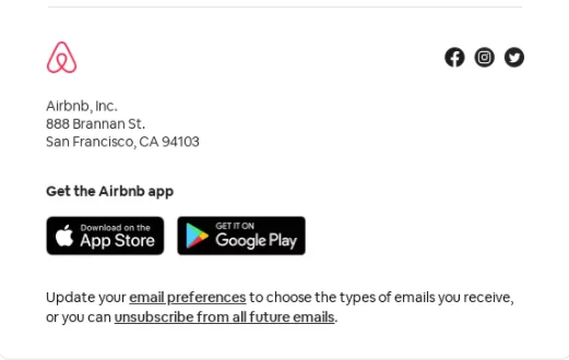
5. Email footer
Generally, contacts scroll all the way down to the footer of your email for two reasons:
- You successfully engaged them to read through your whole email.
- They will go directly to the bottom to unsubscribe.
That’s an email marketing fact. You can’t just ignore it.
For the positive case that you’ve engaged your audience, the fact that they read the whole email shows the intent of further interaction with you or your brand.
Include your company’s contact details, and make it easy for your subscribers to share the email by including social share icons and a ‘Send to a Friend’ option.
This can drive virality and increase the size of your email list by a lot.
You can also include links to the most important subpages of your website. Be careful because too many links and images will make your emails land in the Promotional tab or spam folder.
Which is not necessarily a bad thing, especially if you’re sending newsletters.
However, if you’re eager to land in the primary tab, check out how to get delivered to the primary inbox in Gmail.
Adding too many links can make your email land in the spam or junk folder, especially if the links are from different domains.
5 Email Newsletter Design Guidelines and Tips
1. Create focused emails with the Inverted Pyramid model
Prevent distracting email designs that are crowded with content and do not focus on one primary objective.
It simply won’t get you anywhere except confusing your contacts.
Remember, the objectives of your email are:
- Clicks
- Actions
- Purchases
- Engagement
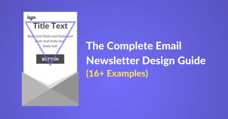
One method to create focused emails that convert is to use the “Inverted Pyramid.”
The Inverted Pyramid method is an email template design to help you eliminate distracting elements from your email and keep it focused on conversion.
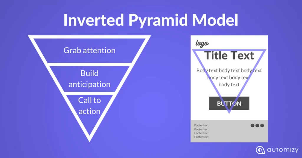
It’s self-explanatory.
- Grab the attention: Use a catchy title to hook your email recipients to read more.
- Build anticipation: Share more valuable information that would motivate your recipients to take action.
- Call-to-action: Add an attention-grabbing CTA.
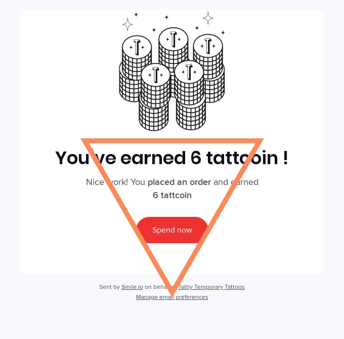
Here I added an inverted pyramid to help you see it in practice.
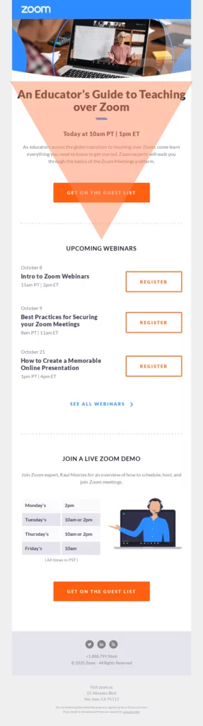
Once you start spotting the inverted pyramid in emails you can’t unsee it anymore.
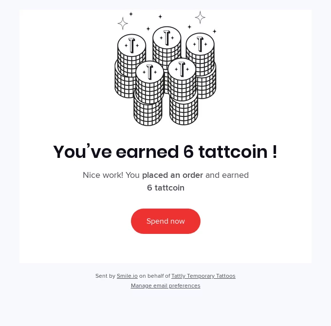
2. Use quality visuals
As 90% of the information processed by the brain is visual, using quality visuals in your email design helps:
- Hold readers attention
- The readers to process information easier
- Increase engagement
A quality visual in your email design can be:
- An animated GIF
- Product image
- Video
- Infographics
“A picture is worth a thousand words.” And in marketing, looks say a lot about a brand.
Take a Christmas email campaign. If the email doesn’t include an image of a tree or Christmas ornaments, it will be just a plain email.
But if you add quality visuals, you’ll make your email more atmospheric and visually appealing.
3. Place CTAs smartly
Your CTAs usually take your email recipients to a dedicated landing page; it could be:
- Product page
- Lead magnet page
- Pricing page
- Blog post
- Youtube video
- Etc
Your CTA in the email can be a button or a linked text.
Color-wise, I can’t tell you which color to use. Because that depends uniquely on your brand.
But also, don’t forget that different colors can evoke different emotional responses.
If your email campaign has a singular focus with one CTA, the placement should follow the logical behavior of email recipients.
People typically read from the top left to right of an email, so it makes sense to place your CTA buttons towards the bottom or to the right of the content.
The most common CTA placement today is the bottom middle. Obviously, the purpose is to keep the CTA and the whole email mobile-friendly.
When it comes to CTA size, here are the tips to follow:
- Make button text stand out, use a larger font size than the one used in body text
- Bigger is not necessarily better; size appropriately
- Preview your CTA on mobile devices
Lastly, don’t overdo it.
Some emails can successfully contain more than one CTA. But I recommend limiting yourself to one primary CTA button.
If your email design is long and narrow, I suggest using the same CTA at the top of the email and one at the bottom.
This way, recipients who scroll through your email can’t access the CTA without the need to scroll back up.
4. Keep your copy scannable
You must keep your email copy short and sweet. Oh! That rhymes, so it’s true.
It’s not just common sense that the shorter the copy, the easier it is to digest. But also people’s attention spans are getting shorter.
Inboxes are crowded with emails which makes the battle for attention a real thing.
I wouldn’t be surprised if you’re scan-reading my article now, so here’s the catch to keep your copy scannable:
- Write a clear, understandable headline
- Write short sentences
- Break paragraphs into short, separate sentences
- Focus the message (make a point)
- Align your email to the center or left
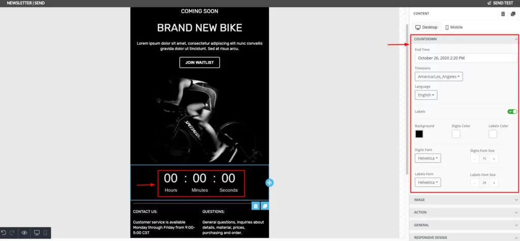
5. Increase sense of urgency
Limited-time offers in emails add a whole new look to the newsletter. It makes the email design more dynamic with the countdown timer.
You can blow a bit of life to your email design by adding a countdown timer and an animated GIF.
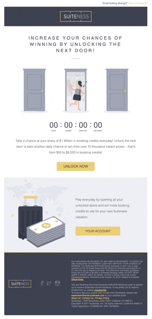
Sign up to Automizy to create limited-time offer emails with a countdown timer and customize it to match your email design.
11 Engaging Newsletter Design Ideas and Examples
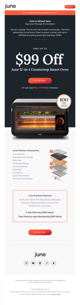
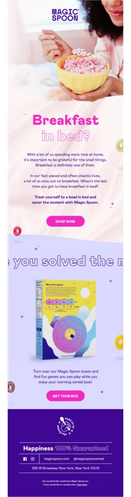
1. Use product images
If you’re selling a physical product, using high-quality product images is an element you can’t (afford) to miss in your email template design
Product images give your online audience a feel of your product and show its utility.
Take the example below, from June. The email doesn’t just feature the product; it makes it seem like a 3D model that pops out of the screen.
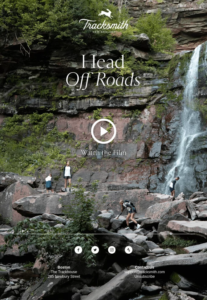
2. Use background images smartly
I personally love background images in emails. Yet, it’s tricky to pull off a beautiful, responsive email campaign using an image as a background.
This example did it just right.
Because background images make it difficult to add text paragraphs on top of the image, Tracksmith keeps their email short with only a few words.
Adding right at the center a video play button with the CTA “Watch the film.”
That’s the right amount of curiosity needed to push recipients to interact with the email campaign.
3. Feature different products
If you go out to the street, you can see all different kinds of people, right?
The same rule applies to your email list.
As many contacts as you can get, they all might come with different interests and preferences.
Long story short, you need to collect data about your contact to understand them and tailor messages to match their preferences.
Using different product images in your email serves you to:
- Display different product to satisfy different contacts
- Collect data based on users clicks on the email
For instance, if you don’t have enough data to personalize your email campaign, you can design an email with multiple products to track contact clicks.
By assigning contact tags to the different CTAs and URLs, you can identify which contact is interested in which product.
If you’re managing email marketing for a car dealership and want to identify those who prefer a Ford Mustang (I do) and those who dig a Chevrolet Corvette, contact tagging is your best friend.
This email newsletter design can be the first campaign you send to learn about your contacts.
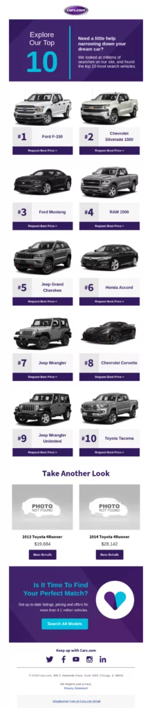
Once you’ve collected a little information about your contacts’ interests, your next email campaign can be more personalized. Sending the right product to the right recipients.
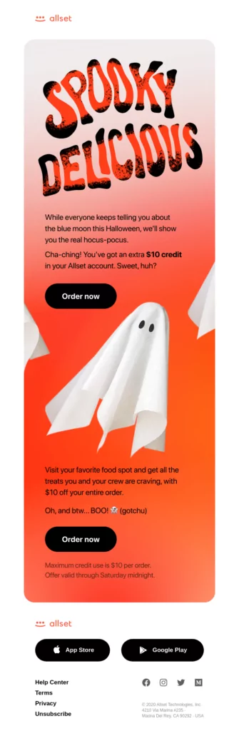
4. Inspire your email design from seasons and holidays
Saint Patrick? Halloween? Fall? Season and festivities are excellent inspirations for your email newsletter design.
Allset food ordering app celebrates Halloween by giving their email newsletter design a spooky touch, using Halloween-ish typography and copy.
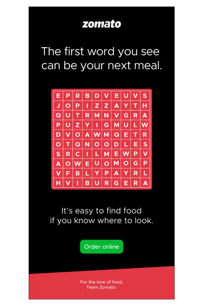
5. Create an interactive design
Zomato’s newsletter design takes their campaign from just a simple restaurant email campaign to a gamified experience increasing contacts’ engagement.
Instead of a typical email design, they used a shorter copy: just 2 sentences and a CTA.
The black email background allows the CTA to remain the most visible element of the newsletter.
6. Create a single-column email template
Using single-column emails helps keep your email responsive and easy to scroll through and supports skim reading.
Single column emails are designed with the mobile user in mind. They’re built long and skinny and are intended to be scrolled through quickly.
This is great for several reasons.
By designing a single-column email newsletter, you put the content exactly where the recipient expects it.
So, single-column emails enhance readability in a big way. Make sure to use it when designing a newsletter for:
- Blog article promotion
- Sharing updates with contacts
- Sending emails with paragraphs
7. Use short text
Keeping your email design short and brief is the best way to hit the responsiveness jackpot.
A brief email helps keep email recipients focused on the CTA. This email campaign design uses black and white colors for the illustration, text, and background.
And that makes the CTA button stand out beautifully, attracting attention.
“Simplicity is the ultimate sophistication.” – Leonardo da Vinci.
8. Include emotional images
Adding a human picture in your email gives life to your email design.
Instead of using stock images that people often find generic, you could take a normal picture displaying a human with your product which can boost an emotional interaction between your recipients and email campaign.
9. Highlight a single primary CTA
When designing an email campaign that includes 2 or 3 CTAs, make one primary CTA that you highlight, and the others should be secondary.
Using the same color for 2 CTA buttons will confuse recipients as they have to decide which one to click.
By deciding on one primary CTA, you keep the attention of your audience on one action that you’d want them to take.
The following email design example uses a dark background, a green color for the main CTA, and a border for the secondary one.
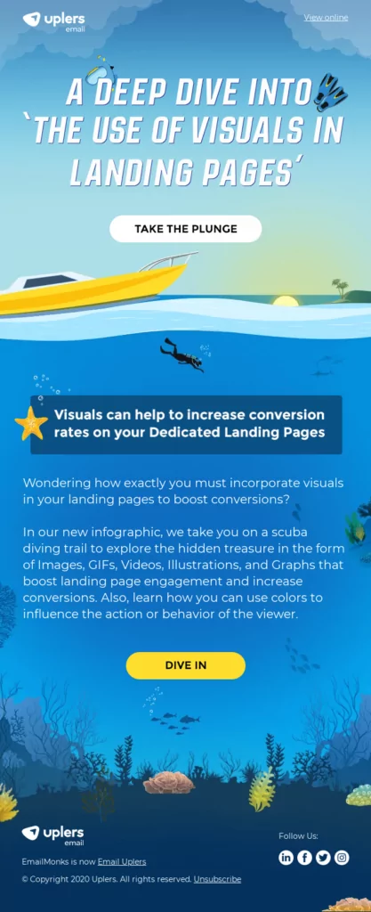
10. Create a thematic email design
Thematic design takes the boring out of your email regardless of what industry you’re in.
Thematic design means that you take a specific theme and design your email and write your copy around it.
Similar to how directors dress up actors to give a vibe to a movie, the same applies to your email design.
Uplers designed a superb email template taking inspiration from the sea and diving.
11. Match your brand
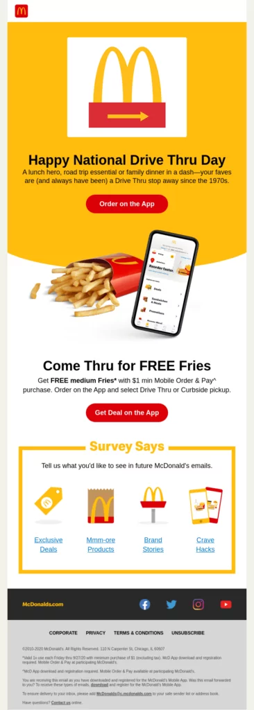
You never see McDonalds using a different color than red, gold and white. In the same way, you never see Starbucks using blue instead of green.
According to Oberlo, consistent presentation of a brand has seen to increase revenue by 33 percent.
The consistency of your brand identity makes your content identifiable by your audience without the need to say, “Hey, it’s me.”
For that, design your email campaigns to:
- Match your website
- Match your identity
- Look like you
If you’re managing or working with a team and you’d want to make sure that everyone follows the brand guidelines, sign up to Automizy to design and save a branded email template.
How to Design an Email Signature
There’s no one way to design your email signature.
It depends on what you want to share, promote or achieve with your email signature or footer.
The elements that I suggest you make sure to include in your email signature are:
- Social media channels
- Contact information (phone number, email, address)
You can take your email signature a step further by including:
- A slogan
- Customer support contact
- Help center link
- Website URL
- Website menu
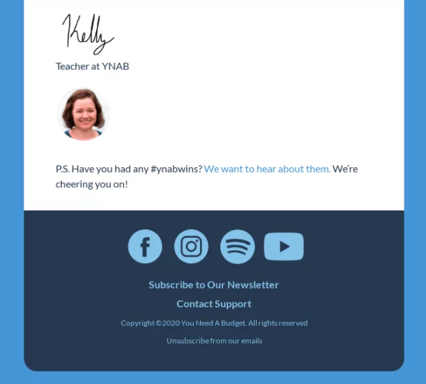
Reflect on your business, think about what you’d want your customers to access, and based on that, decide what elements you’d like to consider when designing your email signature.
Conclusion
To sum up, a beautiful design doesn’t do the job completely. Find the right balance of beauty and conversion.
If the best email design in the world doesn’t bring results, it’s considered useless.
Use the tips and guidelines to design a beautiful, responsive email design taking into account:
- Your brand
- Your customers
Now that you know the best way to design a converting email campaign, the ball is in your court.
Feel free to send us your creative email designs. We’ll spread the inspiration by including it in our articles.