
If you want to create an effective email design, you must not only focus on an interesting copy, subject line, and relevant content, but also on attractive visuals.
According to Venngage, 49% of marketers rate visual marketing as “very important” for their marketing strategy. Brain Rules has revealed a very interesting fact that people are likely to remember only 10% of the information they hear, three days later.
On the other hand, if a relevant image is used with the same information, users retained 65% of the information after three days.
These facts and figures go to show that aesthetics matter a lot for all your marketing communications, and emails are no exception.
Through this article, we shall shed light on how you can use different kinds of visuals to make your emails stand out in the subscriber’s inbox.
Let’s start with static images.
1. Images
Before the end of 1989, emails were sent as plain text and their primary purpose was interdepartmental communications. Later, HTML coding entered the world of emails.
Owing to this advancement, people were able to format the text and add background colors, tables, and images to emails. With the advent of HTML email templates, email marketing became an important marketing channel.
It helped to communicate with the people on a personal level with more relevant content.
Static images are the most basic form of visuals in emails. For instance: Adding an image of a couple holding hands in Valentine’s Day email can convey the message in a much better way rather than a wall of text.
By adding relevant images, you can do away with long paragraphs of explainer text.
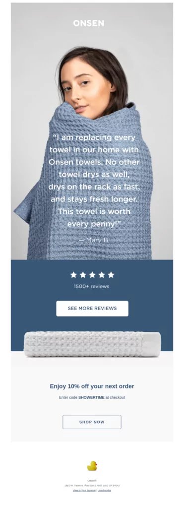
Take a look at this email by Onsen in which they have shared a customer review. The hero image clearly reflects the comfort imparted by the towels.
1 A. Illustrations
Another type of image that you can use in your email is an illustration.
Essentially, an illustration is an image that can be used to explain a concept or a process.
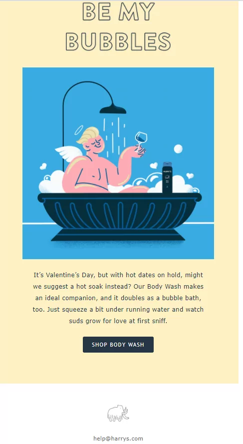
Here’s an email by Harry’s that uses an illustration to promote their body wash.
1 B. 3D images
The third type of image that email marketers are using these days is a 3D image.
Such images increase the depth of the email and make it even more interesting for the subscriber.
If we talk about the origin of 3D images, they were used for the very first time in computers in the 1970s. Later, these images entered the world of emails after gaining immense popularity in web designing.
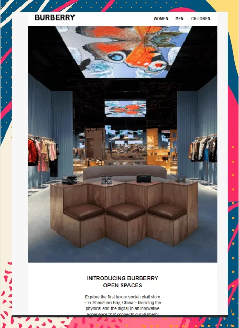
Burberry has beautifully used a 3D image in their email to showcase the innovation of their open spaces.
1 C. Phantasmagoric collage
Recently, I came across this email by Filmsupply in which they have used a collage that generates a feeling of surreality.
Such an image in which bits and pieces of several images are used to create a collage is known as a phantasmagoric collage.
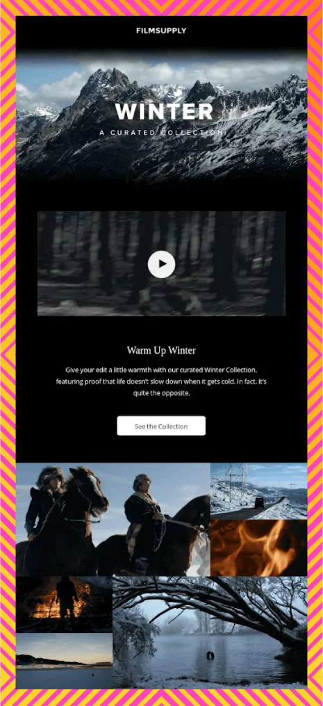
Make sure you use such images judiciously so that they do not overwhelm the subscribers.
That’s all about static images. Now, let’s talk about ‘animations’ in emails – GIFs and cinemagraphs.
Points to Remember While Adding Images in Emails
1. Never send an all-image email as it will trigger spam filters and hamper your deliverability rate.
2. Maintain text to image ratio at 80:20 for all your emails.
3. Email clients block images by default. Therefore, you must always include a suitable alt-text with every image. By doing so, the subscriber will be able to know what the email is all about, even without the images. This is also important from the point of view of accessibility. It will help the screen readers convey the message to the visually impaired subscribers.
4. Avoid adding important information and CTA in the images.
5. Always test the emails for flawless rendering across the different email clients and their loading time. Your emails must be free from any mistakes.
6. Rather than adding stock photos, you can get images designed or add real photographs. Real photographs always have a greater visual appeal when compared to vectors and icons.
2. GIFs
GIFs are a collection of dynamic frames. These frames change in a pre-set duration, which gives the impression that the image is animated.
The history of GIFs in emails goes something like this:
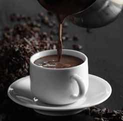
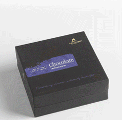
Almost 15 years back in the year 2007, Lake Champlain Chocolates experiments with GIFs in their email campaigns. It improved the conversions by 49%.
Here are two GIFs that they used in their emails.
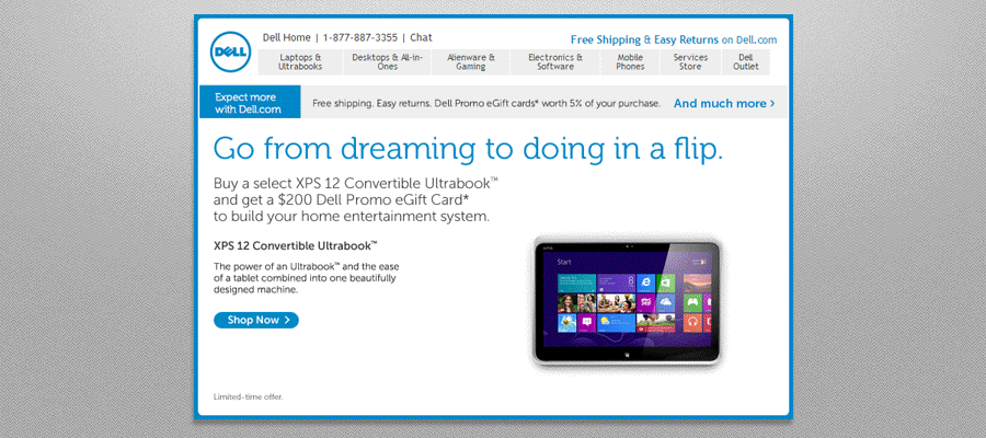
In the year 2014, Dell generated 109% revenue by using a GIF email.
Whether you are a marketer in the travel industry, eCommerce, or telecommunications, GIFs can be extremely effective for your email marketing campaigns.
Besides, you can even use GIFs to demonstrate your SaaS products to the customers.
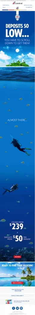
Carnival Cruise Line has added a GIF with a creative long scroll in their promotional email.
Travel industry marketers can take some inspiration from this awesome email.
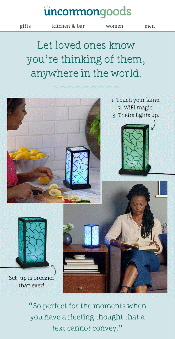
eCommerce stores can display their products or explain their usage with the help of GIFs.
See how Uncommon Goods has explained their long-distance lamp to their subscribers.
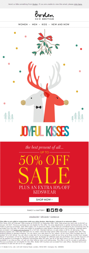
GIFs are an innovative way to execute effective Holiday email marketing. Boden sets the perfect example by sending out a reindeer animation in their Christmas email.
2 A. Animated illustrations
If you want to try something new in your email design, you can go a step ahead and create animated illustrations.
These animations make your emails visually delightful and help you tell a story to the subscribers. After all, the key to effective marketing is “Show, don’t tell”.
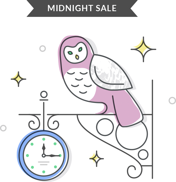
Here’s how Grammarly has promoted their midnight sale with an animated owl and clock.
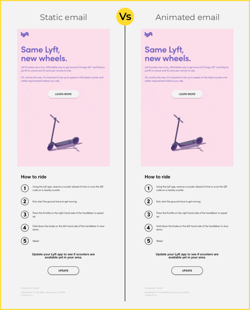
2 B. Animated 3D images
Combining 3D images with animations is yet another way to enhance your email campaigns.
While you can also use static 3D images, animated ones leave a deeper impact and impart a pleasant subscriber experience.
Take a look at this email by Lyft. See how adding an animated image makes all the difference to the way the subscriber will perceive it.
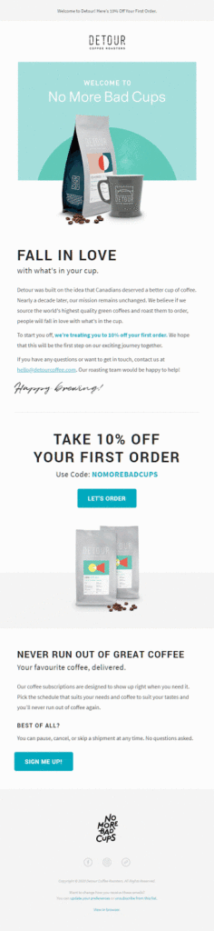
3. Cinemagraphs
In a way, cinemagraphs are also animations. However, they are different from traditionally created GIFs.
As discussed previously, GIFs are snippets taken from a video or animation played on a loop. On the other hand, cinemagraphs have a seamlessly endless loop that takes the subscriber back to a moment lost in time. It gives a surreal feeling to the entire email.
Here’s how Detour Coffee Roasters has used cinemagraph in their welcome email. The animation is sure to tempt the email recipient and encourage them to try their products.
Points to Remember While Adding Animations (GIFs and Cinemagraphs) in Emails
- Never use GIFs that have flashing rates between 2 Hz and 55 Hz as such visuals will aggravate the condition of photosensitive epilepsy.
- Similar to images in emails, add alt-text for GIFs too for people whose email clients do not support GIFs in emails or have images blocked by default.
- Make sure the GIFs do not add to the file size of the email. Your email should not take too long to load.
4. Videos
If you ask me, what’s the creme del creme of visuals in emails, I would say ‘videos’ without a second thought. You can add videos in emails in two ways”
- The first option is to add a video thumbnail with the play button and redirect the user to the landing page.
- Alternatively, you can embed a video right in the email and let it play in the email itself.
The former is an easy option if you want to try out video email marketing. The latter is a bit technique sensitive and you also need to think about the compatibility with email clients.
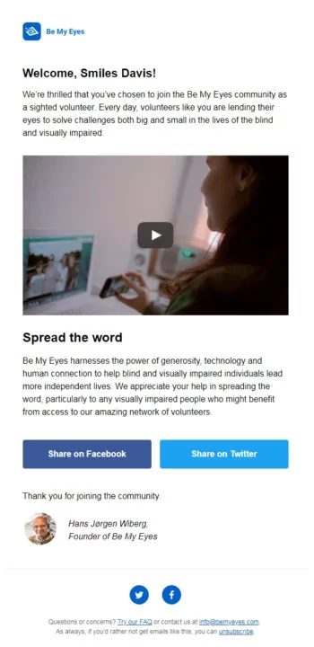
Be My Eyes takes the first approach and adds a video thumbnail image with a play button.
When the subscribers will click on the image, they will be redirected to the landing page or YouTube where they will be able to see the video.
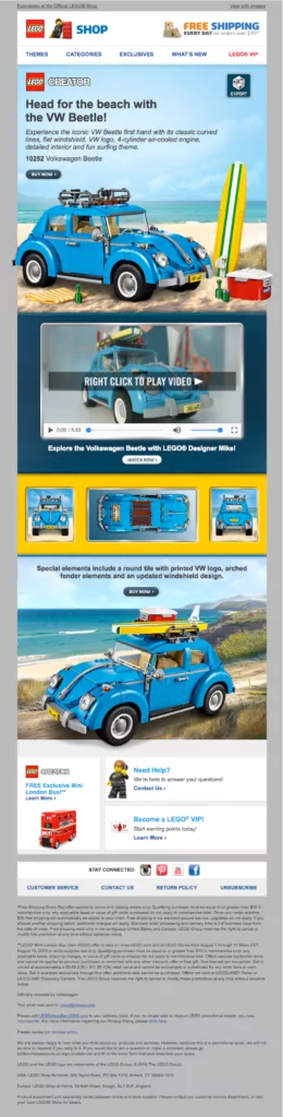
Lego has gone a step ahead and embedded a video in their promotional email for VW Beetle.
The video plays right in the email so that the user does not have to go to any third-party website to view it.
Points to Remember While Adding Videos in Emails
- Always have a proper fallback while using embedded videos. This will help you ensure that your email is rendered properly for all subscribers, including the ones whose email clients do not support embedded videos.
If you are using the video thumbnail as an image, add suitable Alt-text.
- Check whether the image thumbnail redirects the user to the right video or landing page.
Some Other Ideas to Make Your Emails a Visual Treat
1. Monochrome design layout
Many brands are experimenting with a single color in their emails. This does not mean that they are using plain black or white in their emails.
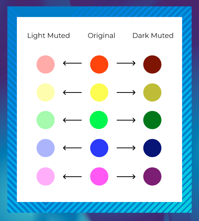
Monochrome designs can be in any color, but most of the companies go for pastel (muted) colors that are desaturated.
Such emails look clean and keep the subscribers focused. As the design is pretty simple, the user is less likely to get distracted.
Monochrome emails have a uniform appeal and they help to draw the reader’s attention to the message.
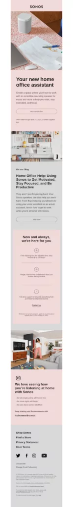
Sonos sends out a monochrome email to pitch the new home assistant along with an exclusive offer.
The image and background are chosen in such a way that they render an aspirational feel to the email and a premium appeal to the product.
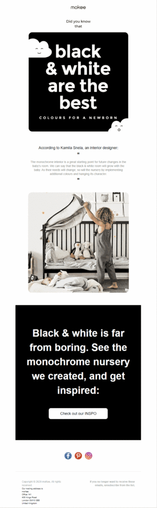
If you want to do something different in monochrome layout, you can incorporate animations in the email as mokee has done.
You can go for monochrome email designs if you want to create an effective newsletter template that yields conversions.
2. Gradients
Besides the monochrome layout, there’s another element that can make your emails more aesthetic. That element is gradients. If you have used Microsoft PowerPoint in the 90s, you will be familiar with this screenshot.
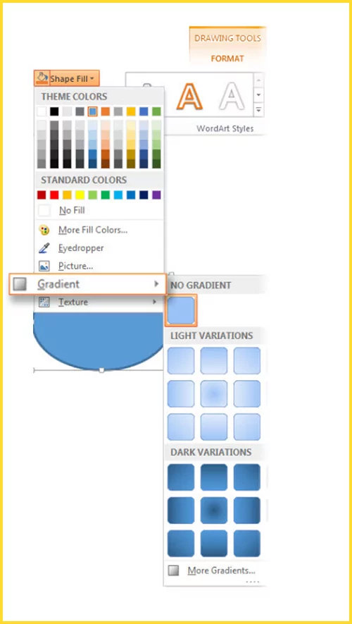
Just like they enhanced the background of the PowerPoint presentation, they also make the emails look more impressive.
Gradients are color transitions with a smooth blending of different colors. This is a visual element that is inspired from Mother Nature.
Whether it is the crimson red and blue sky during sunset, the seashore, or the rainbow, all are gradients created by nature.
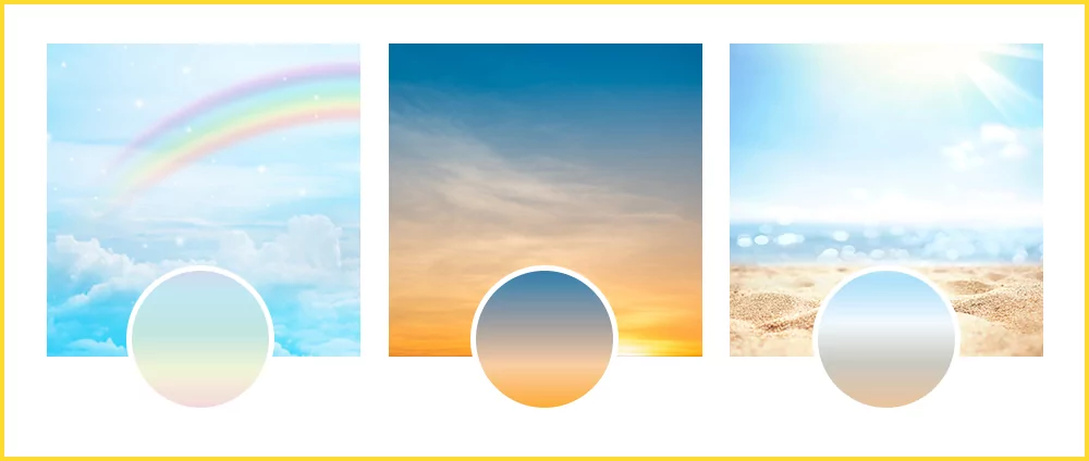
Using such designs will give a fresh look to your emails and help you establish a stronger connection with the reader.
As these designs look ‘different’, they impart a memorable experience to the reader.
This will ultimately lead to a better brand recall.
Another reason why such visuals in emails work is that human brains are programmed in such a way that our eyes always move from a darker shade to a lighter one.
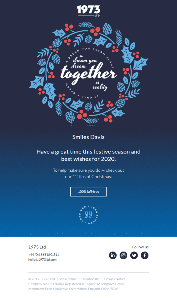
Take a look at this Holiday email by 1973 Ltd in which they have used animation in the backdrop of a gradient.
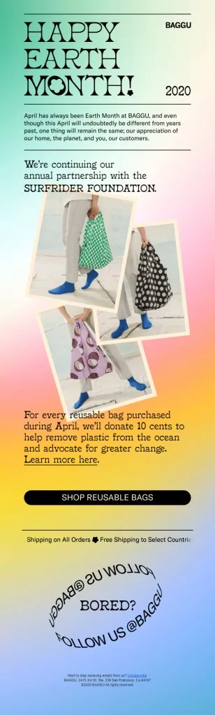
Alternatively, you can also use gradient descent without any animations as Baggu has done.
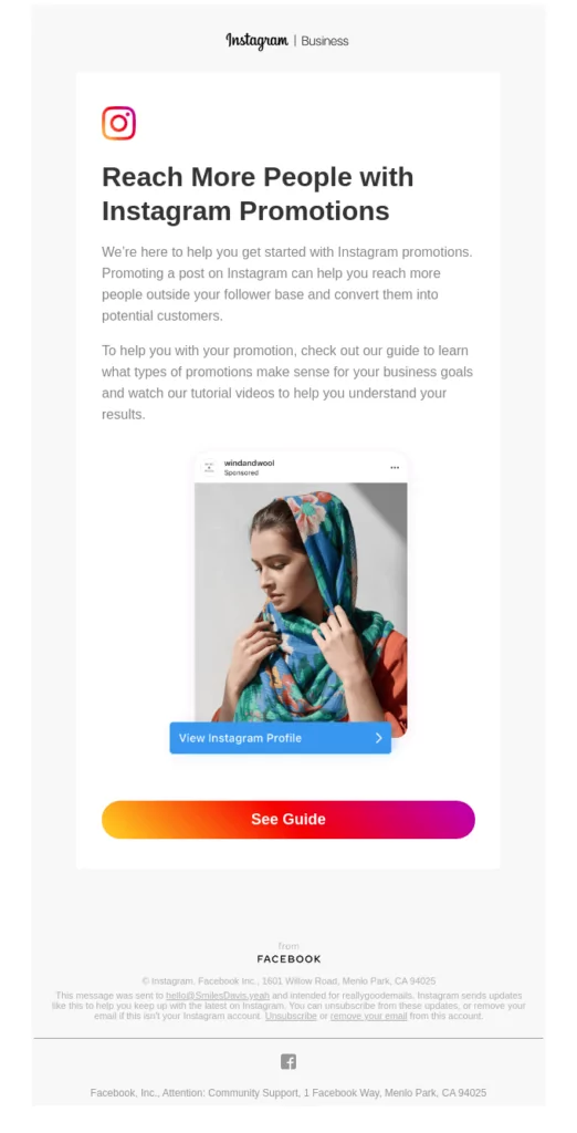
Some popular brands like Instagram use gradients in the CTA. Take a look.
Visual Hierarchy: The Key to Using Visuals Effectively in Emails
All these elements add visual oomph to your emails. However, if you do not follow the basic principle of visual hierarchy, you might not get the desired results.
Following visual hierarchy allows you to aid the eye scan pattern of the email recipient and encourages the reader to scroll till the end.
Such designs cause almost no eye fatigue to the reader as the information is placed in a systematic manner. The message of the email becomes easier to consume as the user does not have to search for it.
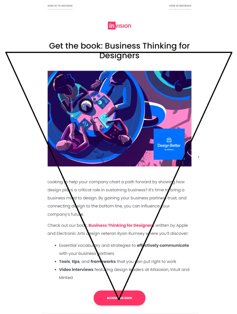
Here’s the simplest example of visual hierarchy in email. The headline is placed right at the top with a relevant copy following it. The CTA is placed at the end.
Wrapping Up
Adding visuals in emails is slowly transcending to be an email design best practice.
However, it does not imply that plain text emails will go dead and obsolete.
Use visuals prudently and keep optimizing your emails based on the email analytics and most important KPIs. Just because every other brand is making use of visuals in emails, it does not mean that you have to join the rat race.
Figure out what works the best for you. Get your creative juices flowing and use email designs that help you achieve the desired open rate, click-through rate, and conversion rate.